Arctic Potion Branding
Independent client project – Brand Creation
Arctic Potion is a Singapore based startup, producing skincare powered by Nordic-derived ingredients. The brief was crafting a brand identity, that communicated proven performance, science based methodology and quality ingredients. As Arctic Potion is starting out in Singapore, the brand’s target audience is in Southeast Asia. The product however is produced in Finland and uses Nordic ingredients. It is therefore important that the brand both speaks to the target audience and reflects the Nordic product.
This identity brings the name Arctic Potion to life through the idea of Nordic Magic, where extreme environments meet transformative care and a little bit of magic.
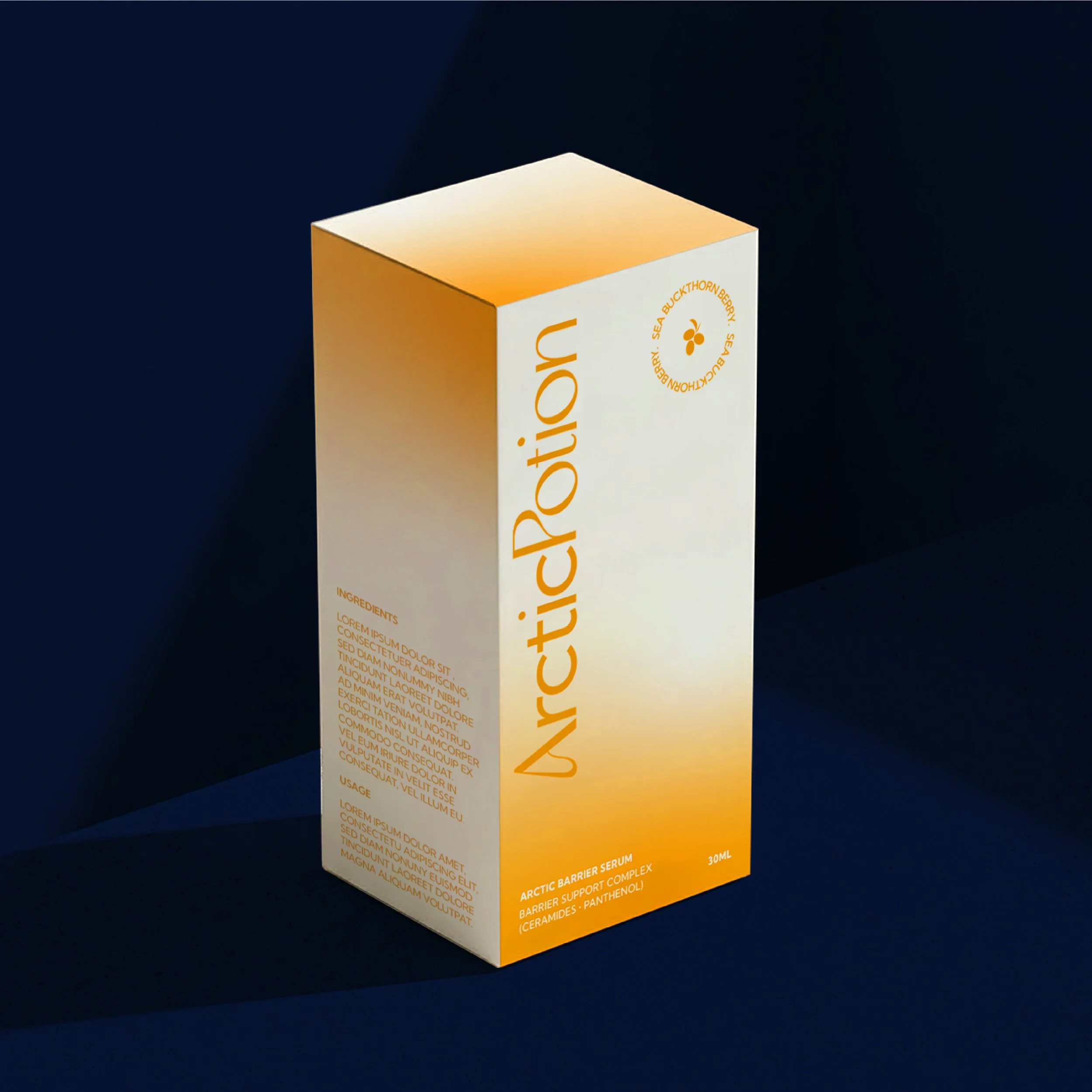
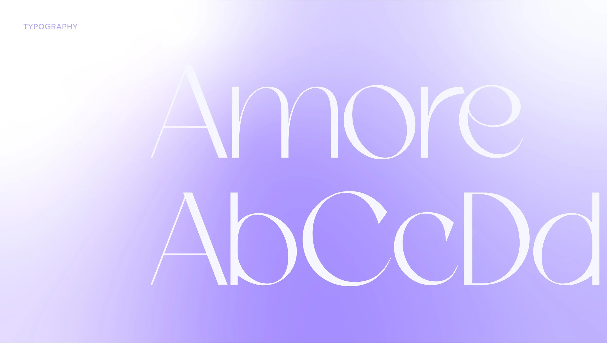
The Arctic Potion logo combines two typefaces, reflecting the two sides of the name and the idea of the harshness of the environment meeting the softness of skincare. The clean and modern sans serif typeface used in Arctic reflects the clean lines of the environment, whereas the display font of Potion with fluidity in its form reflects the magic and potion side.
The A further connects to the North through the snowy Mountain like shape. It also represents an
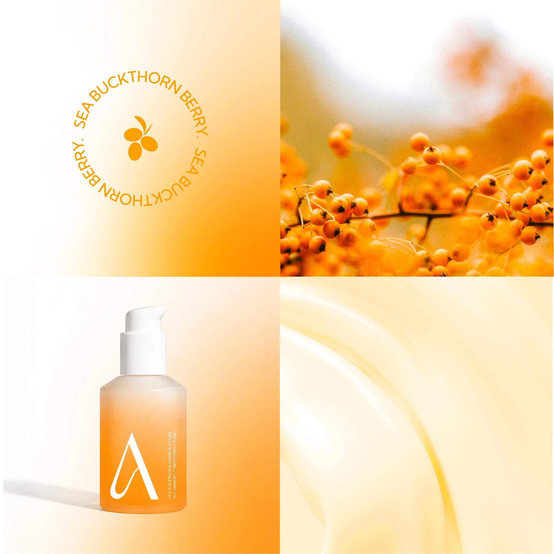
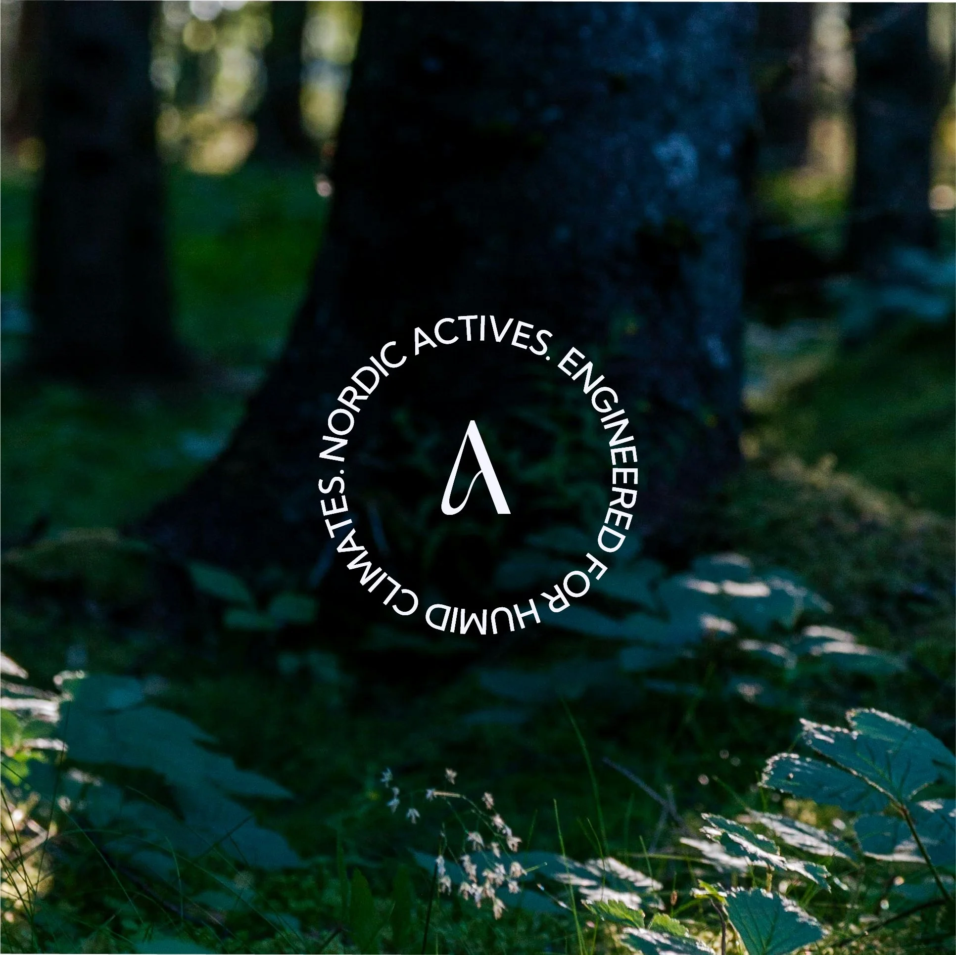
arrow, pointing to the North. The A is used outside of the logo as graphic element throughout the brand, including a roundel device with our brand message.
Soft transitions, diffused gradients and refined typography create the brand palette. The palette reflects magic beneath the surface: a nourishing, calming and restorative experience on skin, beside the cold exterior. The colour palette is inspired by Nordic nature: the deep sea, aurora, arctic sky, berries and the forest.
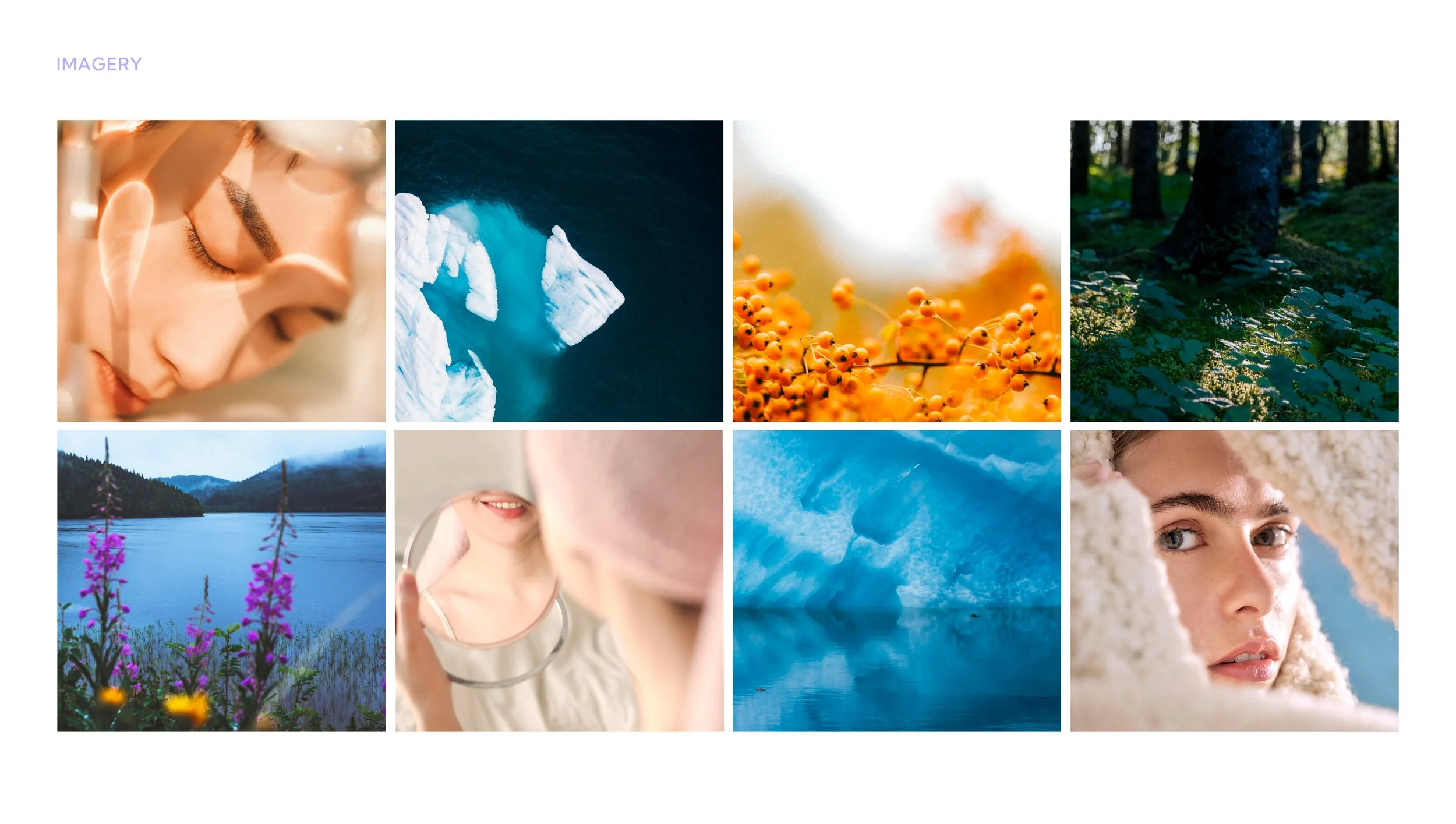
The brand imagery uses Nordic nature imagery that feels raw, clean, peaceful and calm, whilst also communicating adaptability, resilience and proven performance, creating a visual language grounded in science, speaking to the methodology behind the product.
The images used highlight the pureness of the Nordic environment, the changing seasons and the resilient plants that thrive in this environment – like Arctic Potion’s here ingredient, the Nordic Sea buckthorn berry. The imagery shows the full range of the Arctic seasons, not just winter, snow and icebergs, to speak to adaptability and to avoid an overly cold and harsh visual language.
Imagery that shows faces with focus on the skin is also important for people to connect the brand to the product. People imagery tells a story and feels soft, intimate and warm.

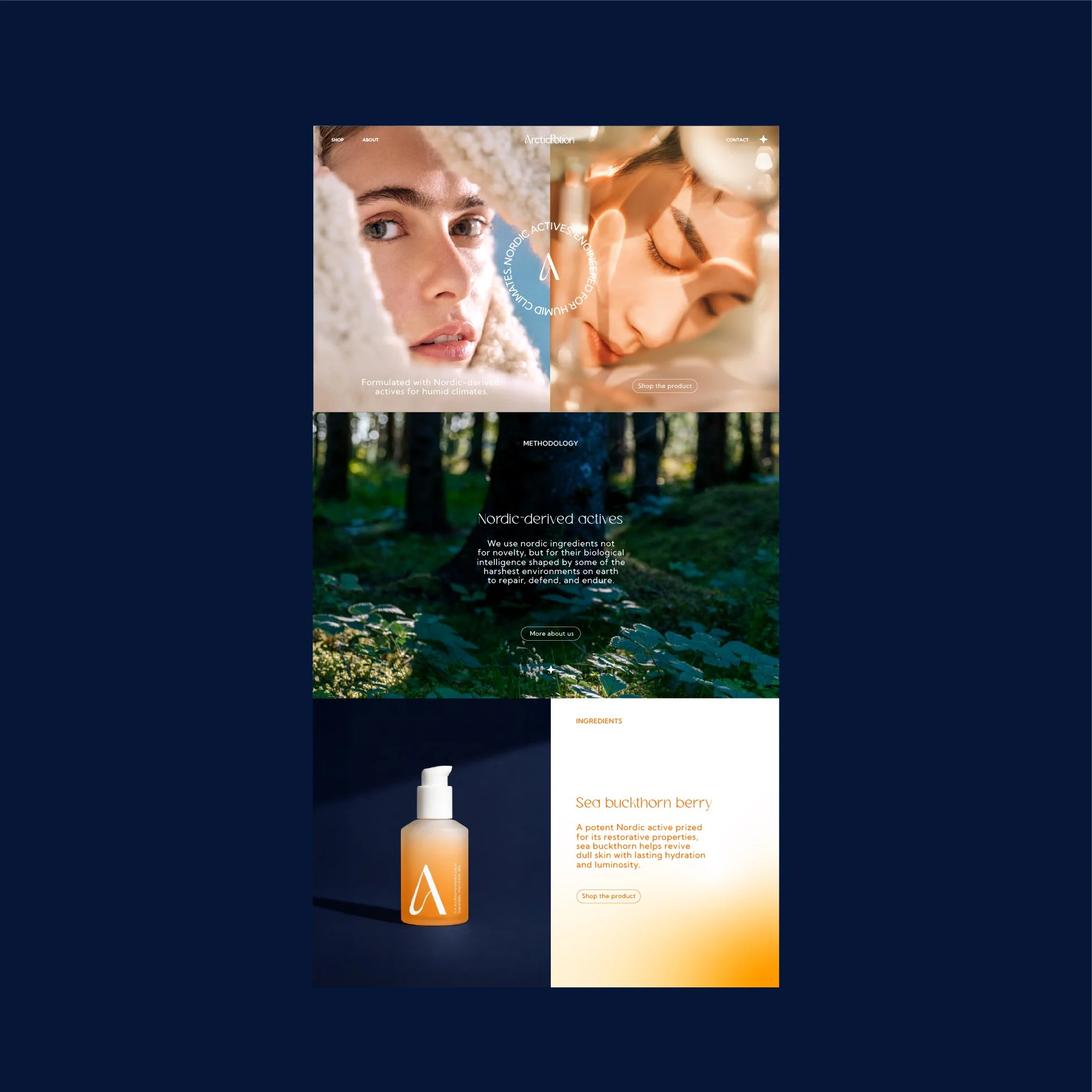
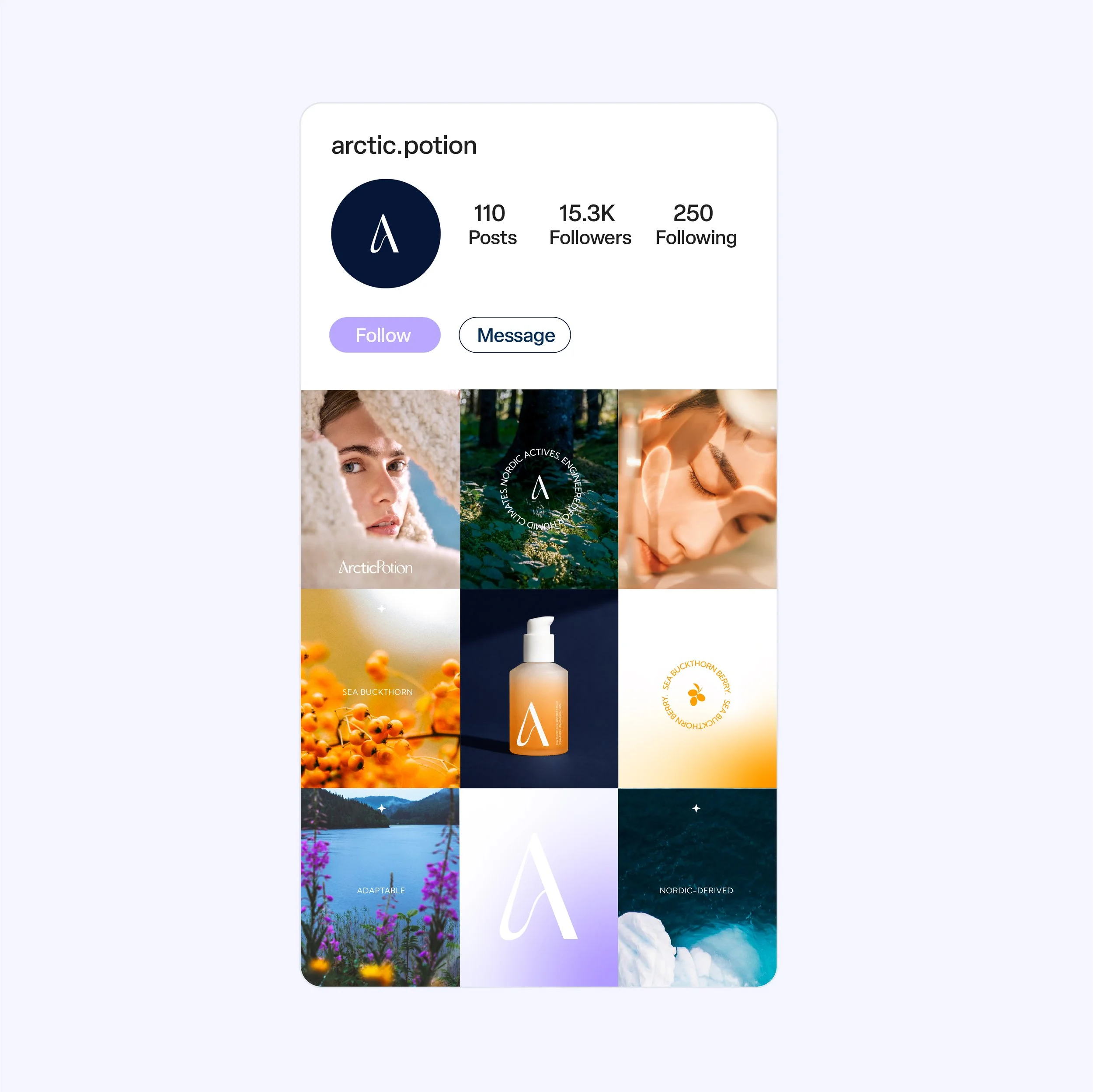
Packaging is monotone, with product-specific colour introduced through the key ingredients used in each formulation. The current range consists of a Sea Buckthorn serum, however the identity was designed with future growth in mind, allowing the system to expand seamlessly across a wider product line.