SeidrLab Brand Refresh
Independent client project – Brand Refresh & Guidelines
SeidrLab is a human-first AI transformation consultancy and technology company. Seidr, meaning wisdom and foresight in Old Norse, was historically about guiding leaders through uncertainty. For SeidrLab, it’s a reminder of the qualities required for AI transformation: clarity, vision, and trusted guidance at moments of change. This was a key insight in our creative approach, when SeidrLab approach me looking to refresh their brand. The brand refresh was the first stage of the project, followed by a redesign of their guidelines.
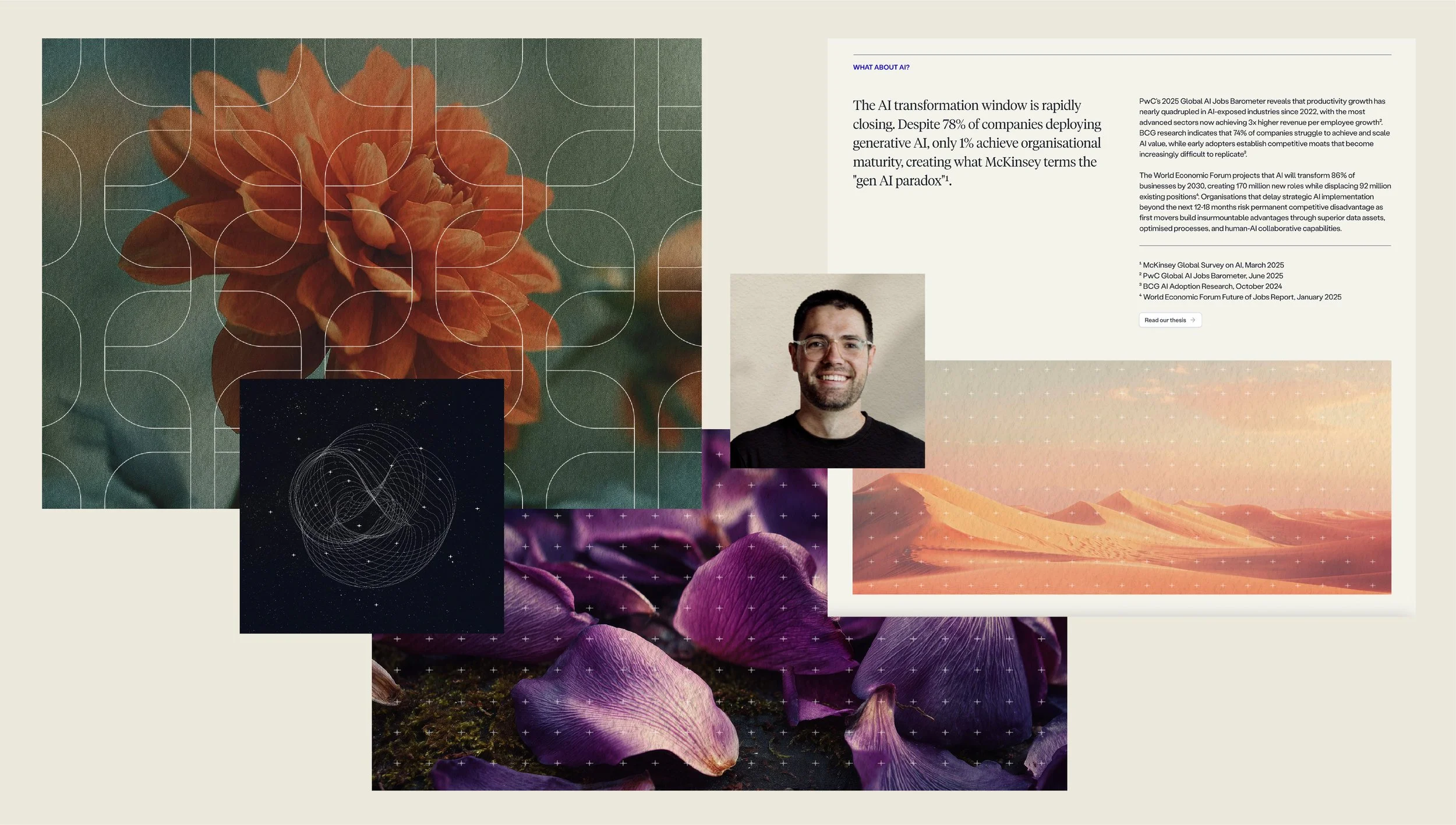
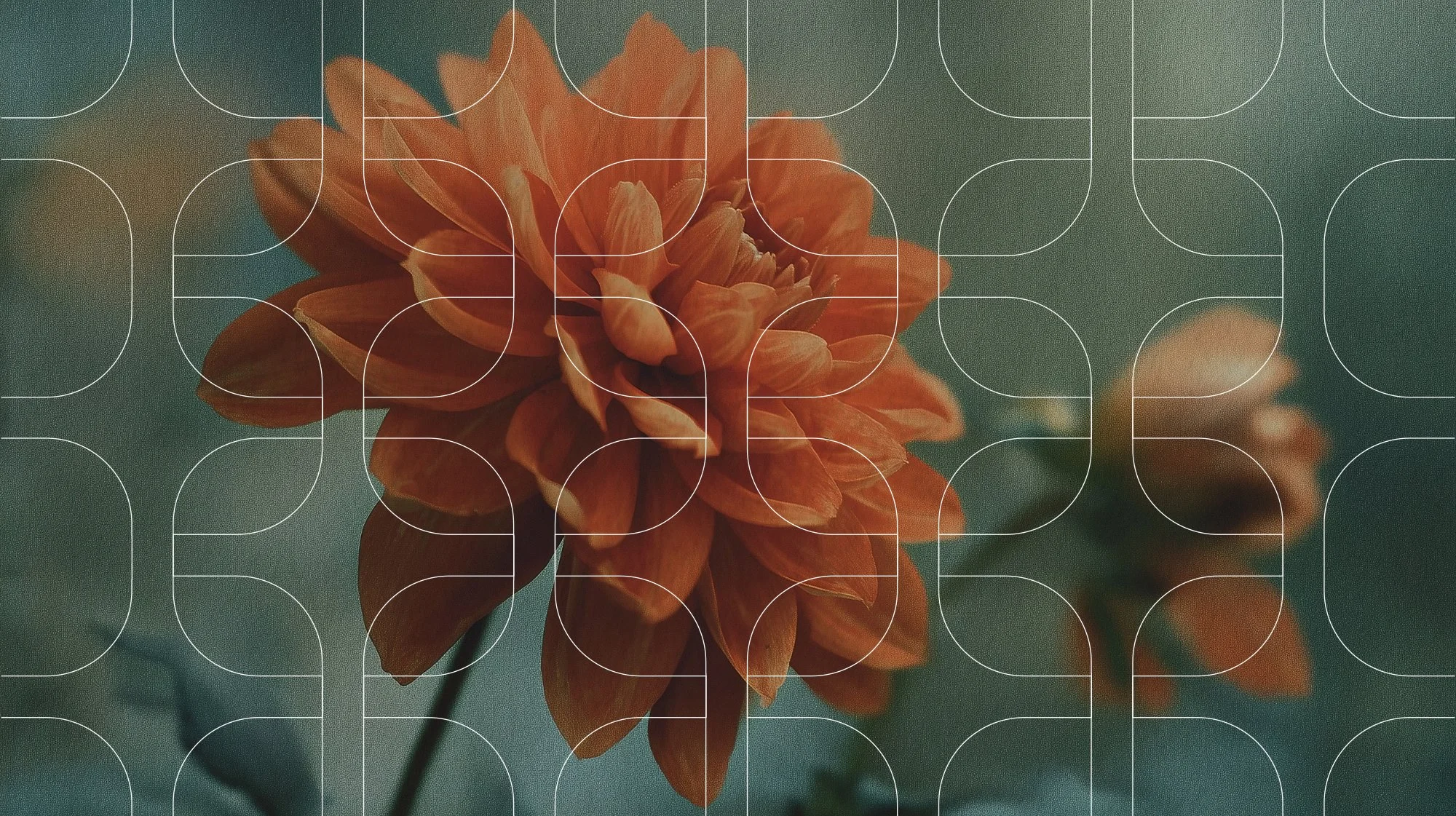
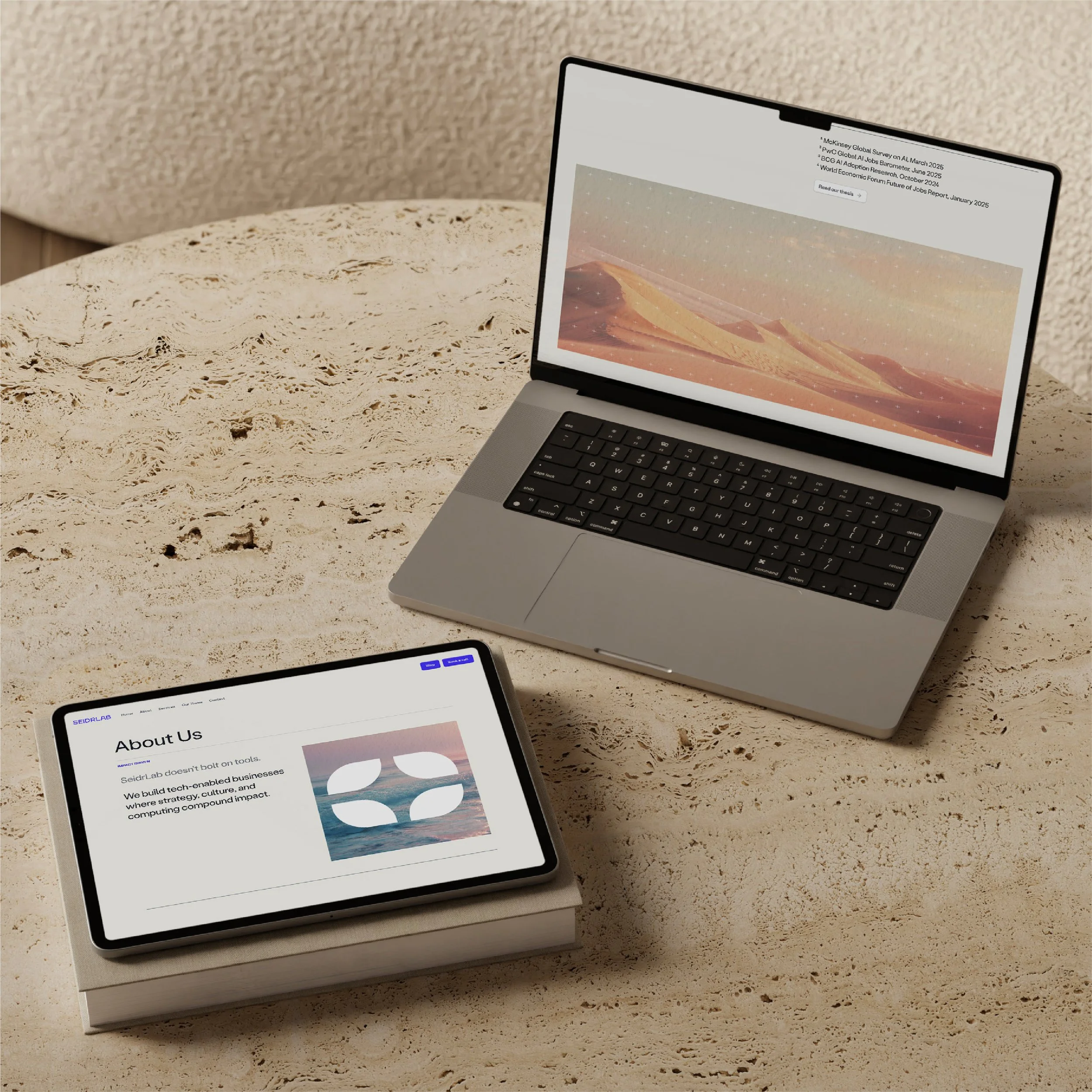
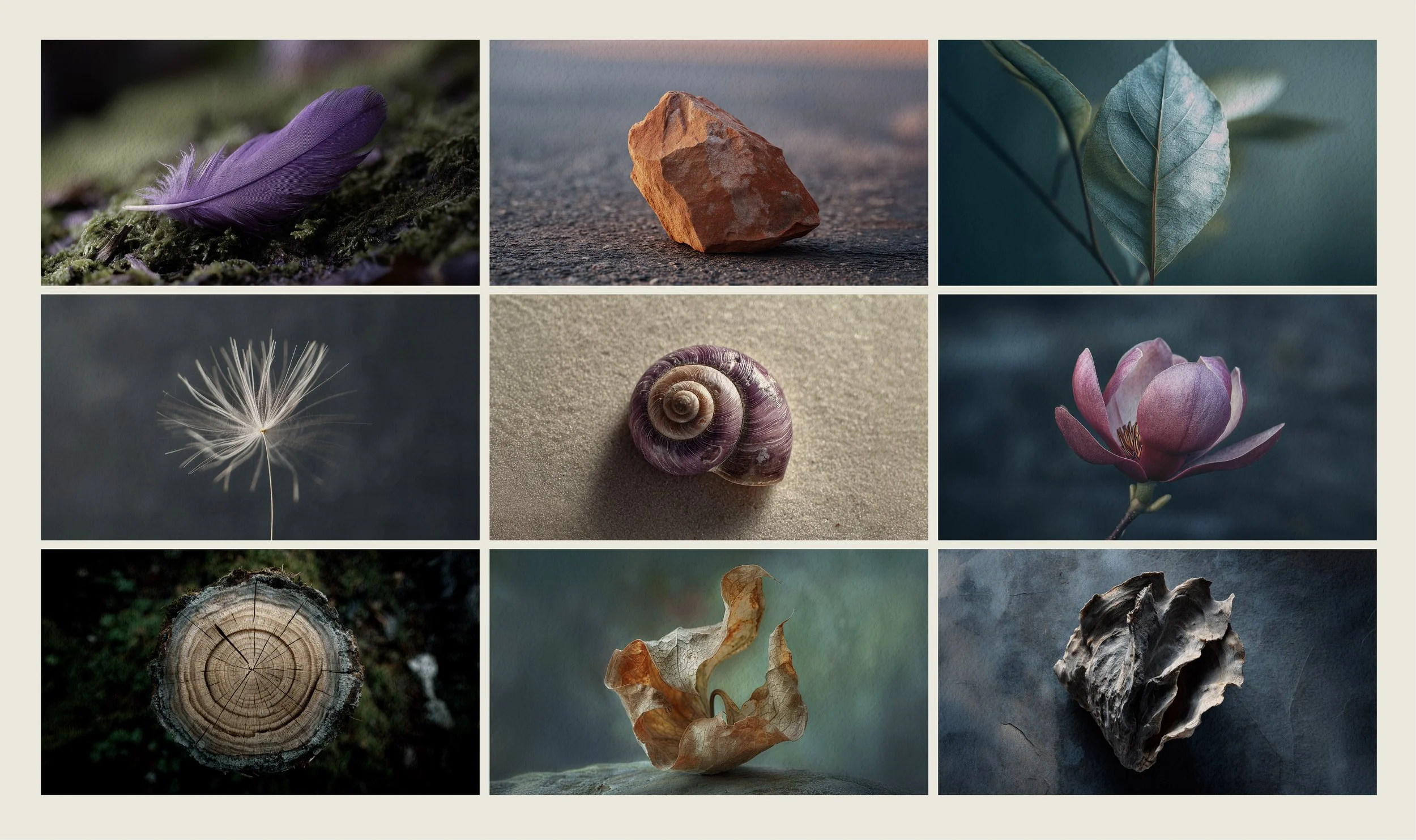
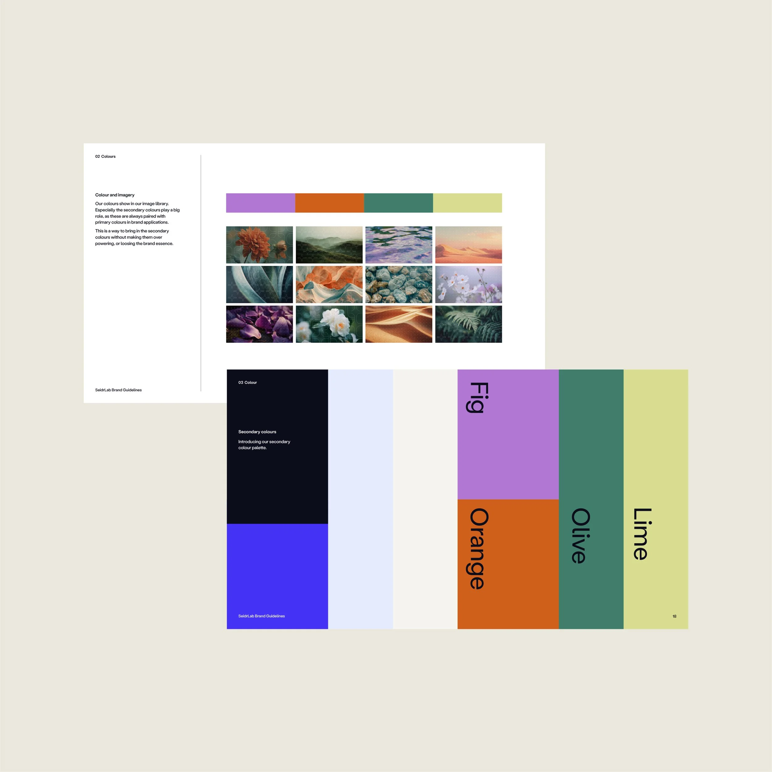
A new branded image approach was a big part of the brand refresh. We called the new direction Soft Naturalism. The concept was inspired by the human-first perspective, and the idea of organic meeting synthetic. Using Midjourney in combination with photo editing, technology is blended with ethereal nature imagery and painterly, paper-like textures. Expressing transformation, resilience and efficiency. The muted colours further connect the AI generated images to the organic theme.
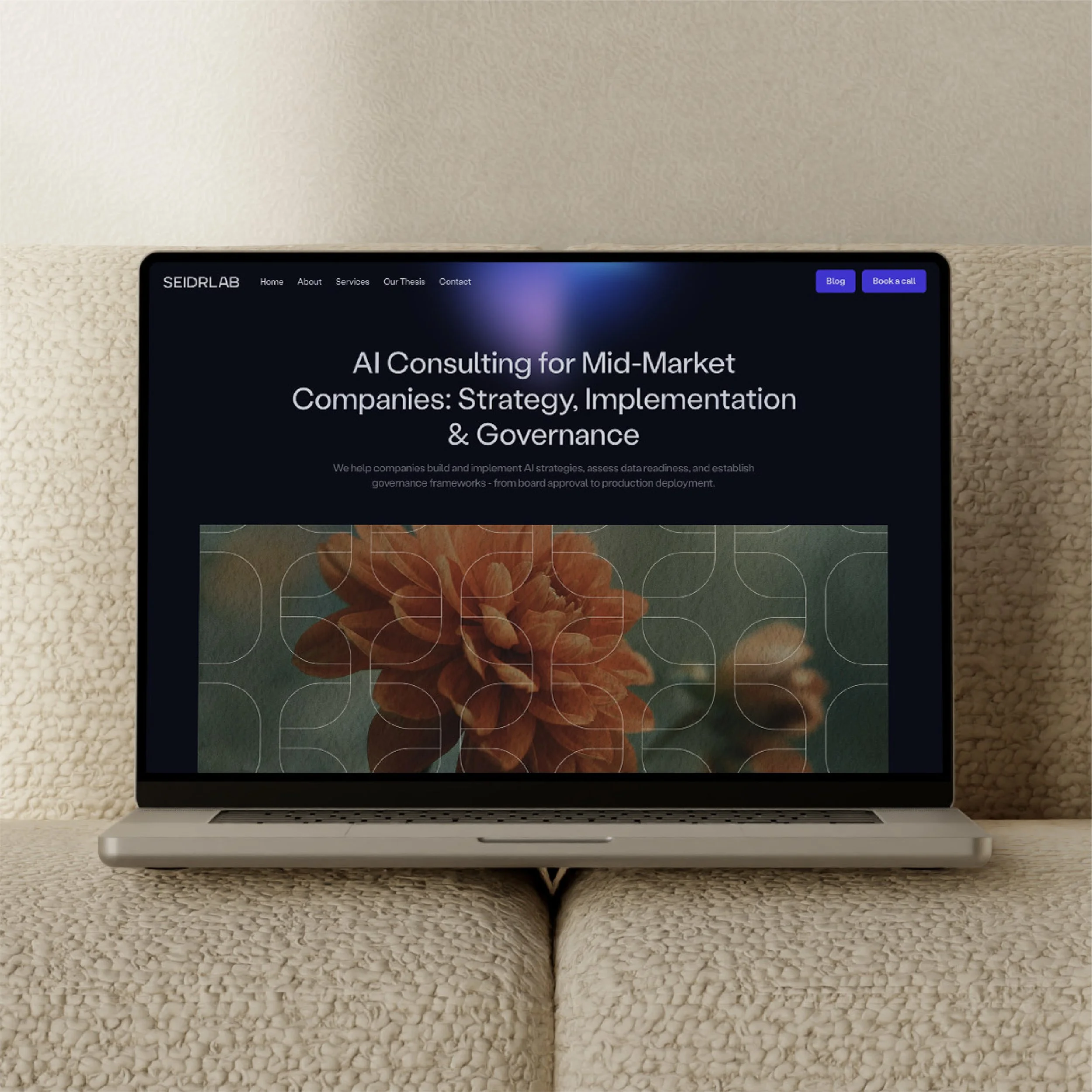
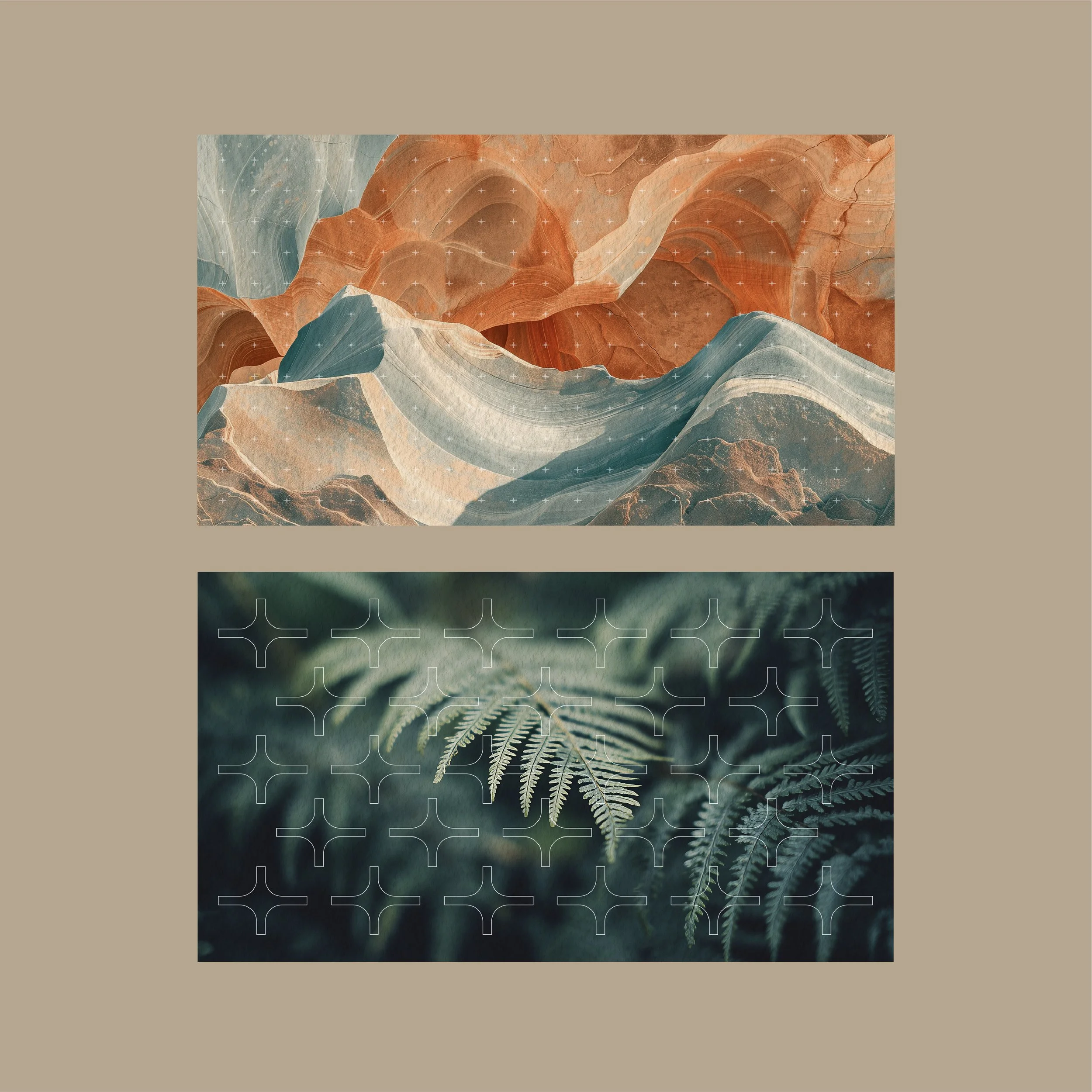
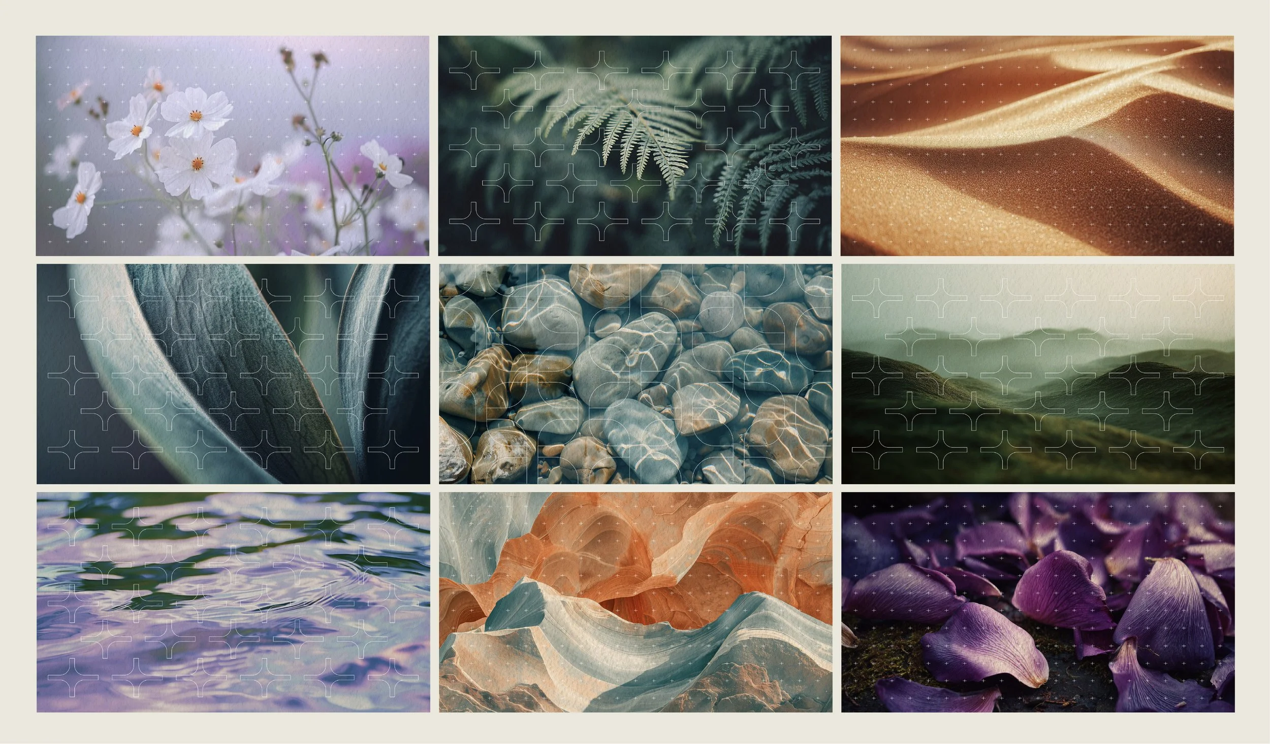
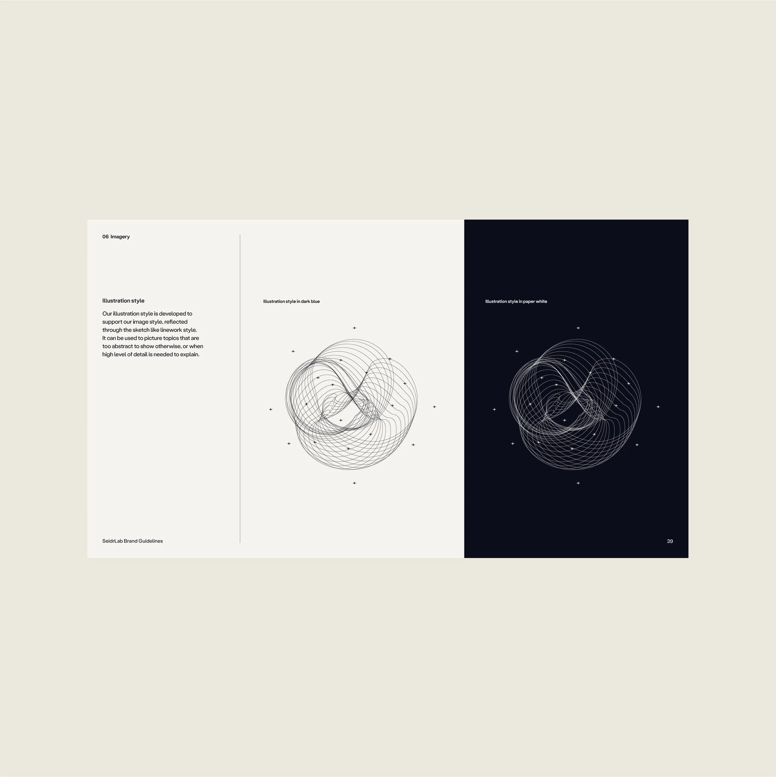
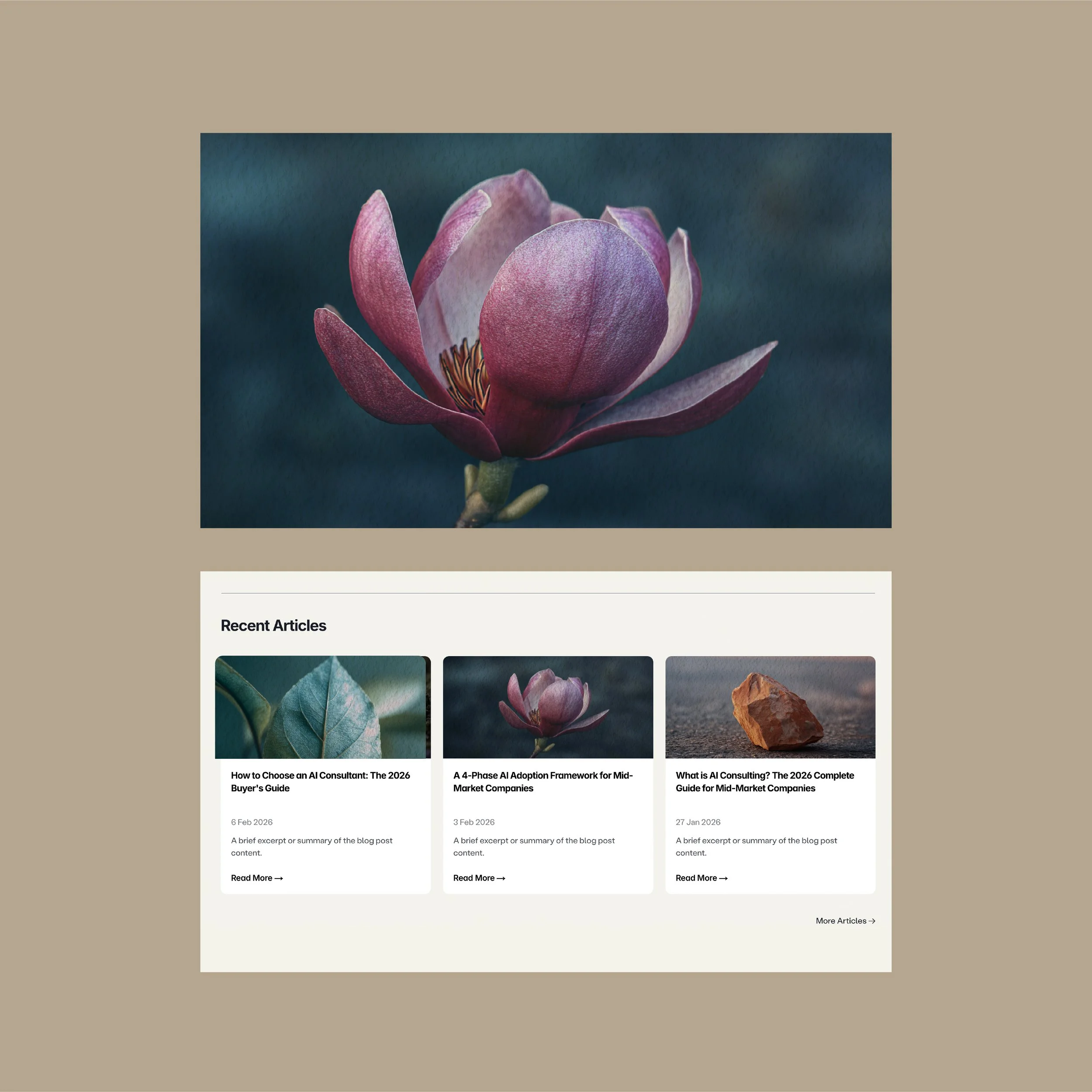
The sparkle shape in the SeidrLab logo was used to design three brand patterns, symbolising the mathematical precision behind AI and data science. Where the generic webpage imagery applies the new brand patterns and uses more landscape style imagery, the blog page images display closeups of organic objects instead. This style reflect the idea of focusing on one subject matter at ones, just like the feature articles do. The patterns have also been left out of these images to avoid an outcome that looks too busy, as well as to strengthen the use of the pattern by adding rules around it.
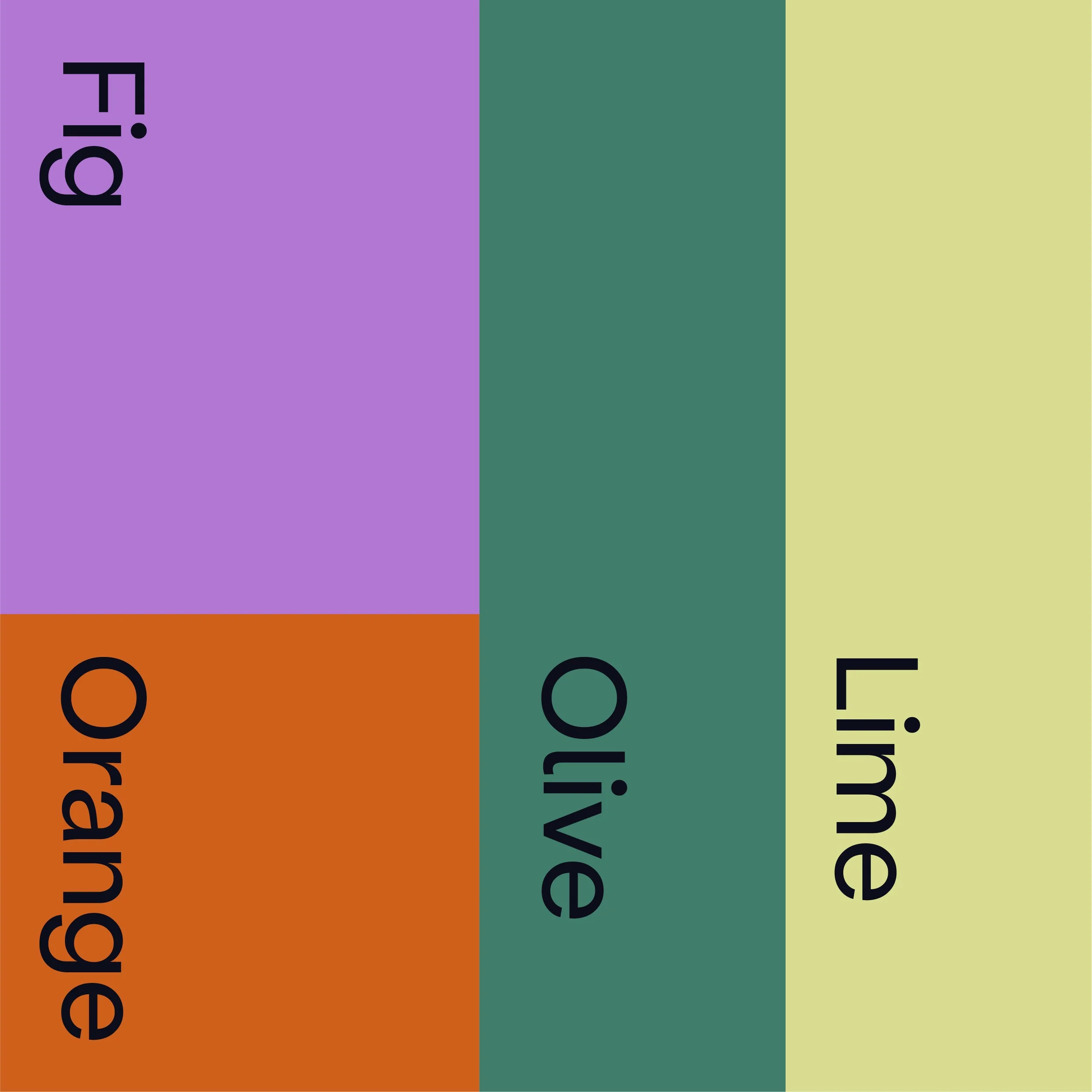
Part of the refresh, we looked at Seidrlab’s brand colour palette. The primary colours were kept, but a new secondary colour palette was introduced. The palette is reflected in the brand imagery, and is a combination of earthy and fresh, reflecting the thinking behind the Soft Naturalism theme.
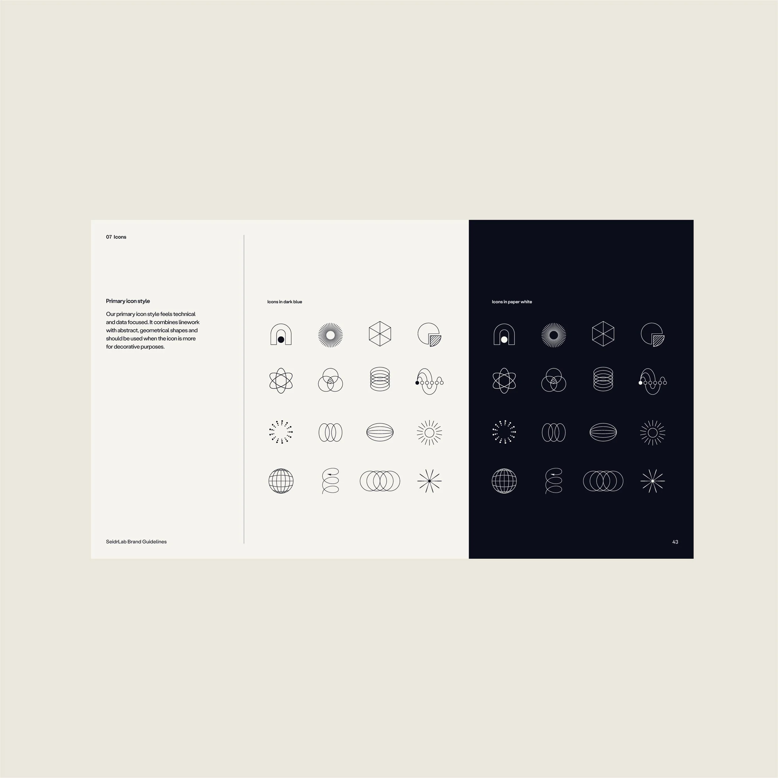
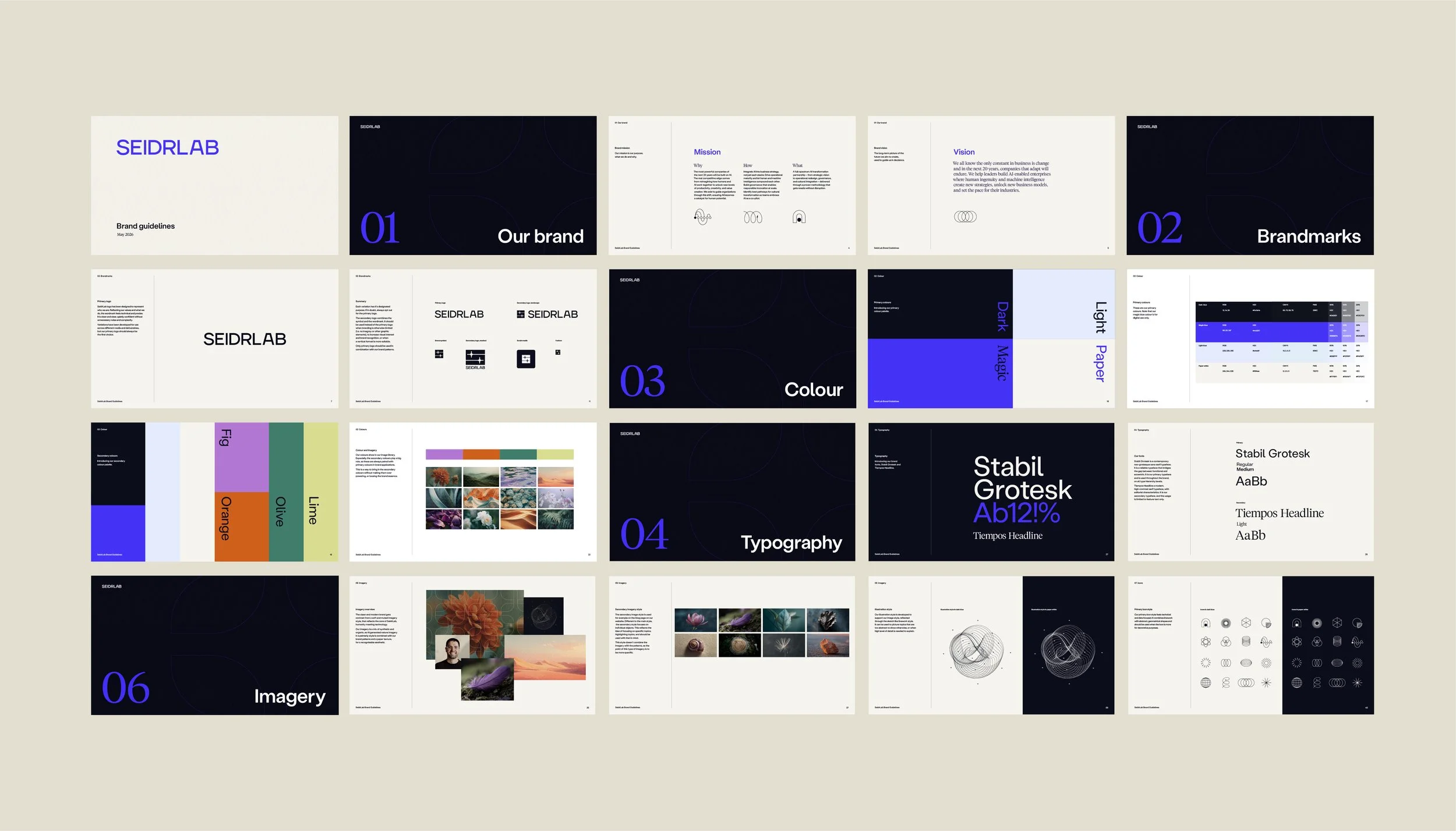
Besides the brand imagery and colours, the refresh included looking at and refining at SeidrLab’s logo suite, brand typography, icons and illustration styles. The second stage of the project was re-building the company’s brand guidelines, both to reflect the refreshed brand system as well to offer further guidance on how the brand should be applied.